Through the course of the previous semester, I have been taking a class called "Typography and the Book Arts" during which we write, design, and publish our own book as a class. This semester we created a book titled
Out of Sorts or
All Sorted Out.
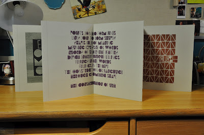
The book is a two-sided, accordion fold book which is stored in a colored plastic case. We selected this case in order to limit the amount of time to bind the book but also because the clear plastic allows the reader to view both titles of the book (one on each end). The advantage of an accordion book is that it can act as a display book by standing up on a long table such that all the pages are visible at a single time.
 |
| The purple text here is mine! |
The goal of this years class was to design our own font based off of an image by German artist, Hans Schmidt. This font was based off of simple geometric shapes because we began the class by carving our own letters into 1.5" tall cherry wood using a hand chisel. However, part through the class a small subset of students (myself included) began to work on turning the hand drawn and carved font into a digital version which could be used on any computer.
To develop the content of the book itself, we wrote short paragraphs based on our experience with the process of designing and producing our own font. On one side of the book (
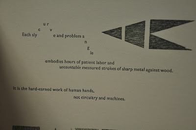
All Sorted Out), each student was given a single page for the short text they developed and decorated the page by selecting a couple words which highlighted the message of the text.
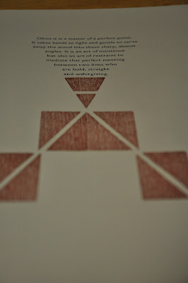
Here are some pictures from the page which I wrote and designed:
Next, here are a couple pictures from some other interesting pages on this side of the book:
 |
| Page Designed By: Winnie Ding |
 |
| Page Designed By: Tessa Jacobs |
On the other side of the book (
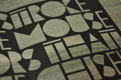
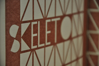
Out of Sorts) we showed the evolution of the images created during the class. These images are much larger centerpieces but also contains the table of contents, introduction, colophon, and artist signatures. My professor for the class enjoyed the text that I wrote for the side explained above, and decided to include it as a centerpiece on the back. This piece was the purple image mentioned above, but here are some more details from that image:
And here are some pictures of a couple other interesting pieces from this side of the book:
 |
| Text By: Travis Athougies |
 |
| Page Designed By: Drake Escrofani |
The experience was a very difficult one and involved a lot of work. Setting up each printing press takes hours on its own and the actual printing process for each page consists of another few hours. Of course, the large wood blocks in our own alphabet had to be printed separately from the small metal type, which meant that every page had to go through the press multiple times. Additionally, since every page is double sided, a single page had to be printed on with about 3 different times. A mistake at any step of the process would ruin the page and limit the number of books which would ultimately be published. However, despite all the work and stress, it was a fun experience and the outcome is wonderful.
Overall, we made about 100 copies of the book. About 20 of them went to students in the class, the professor, and the Scripps college library. Then, there are a large number of individuals who pre-order the book every year because they want to support the press. Finally, there are some books left over which are available for sale to anyone who is interested in purchasing one.
